Visual language and database visualization, pt. III
MySQL Workbench, Anchor Modeler, TLDraw, Arrows.

On January 23rd, 19:00 CEST (in about a week), we’re going to host the “Minimal Modeling of Twitter.com, without database” Zoom meeting.
Registration link:
https://us02web.zoom.us/meeting/register/tZIsdu-hqjkoE9ZtFYEzSJpFxo_h5ynYOTfc
Details: https://minimalmodeling.substack.com/p/jan-23-1900-cest-zoom-minimal-modeling.
Visualizing database using Minimal Modeling
Previously in this series:
minimalmodeling.substack.com/p/how-to-visualize-your-database-using: Part I: how to present parts of your database visually, represented as simple graphs;
https://minimalmodeling.substack.com/p/visualizing-database-using-minimal: Part II: Minimal Modeling for data analysts;
Today we’ll take a look at some other visualization styles and discuss the visual language. But first let’s take a step back and see the kinds of documentation we have in Minimal Modeling:
Catalog of anchors, attributes and links;
Narratives;
Pictures.
Database documentation in Minimal Modeling
Catalog of anchors, attributes and links is the foundation of documenting the database using Minimal Modeling. One important thing about catalog is that every entry is independent from each other.
For example, when we describe some attribute, such as price of an item, we have to write a very small amount of text. Most of the time it’s going to be just a single sentence, expressed as a question: “What is the price of the ⚓Item”? The smallest piece of data about an item is just:
id | price
 3 | 100 USD
Here, the price of an item with id=3 is 100 USD. We don’t need to know the name of the item, which customers bought this item and when, how much tax was added as part of the sale, etc. All this other information is described in other attributes and links: “what is the name of the ⚓Item?” (attribute), “⚓InvoiceLineItem includes ⚓Item” (link), etc.
Narratives
Larger business processes are described using narratives (this is a term from Minimal Modeling that we didn’t talk about yet). Narratives are just explanatory text:
“Customer adds items to the shopping card, and on checkout the invoice is created based on the contents of the shopping card. Etc, etc”.
But narratives refer to the catalog of anchors, attributes and links . So, the text above assumes that we already have the following attributes and links described:
⚓Customer has ⚓Item in the shopping card (link);
⚓Customer initiates ⚓Order (link);
What is the unique number of an ⚓Order? (attribute);
⚓Order contains ⚓LineItems (link);
⚓LineItem refers to ⚓Item (link);
etc., etc.
Each of those attributes and links document the actual physical tables and columns that store this data, so it’s pretty easy to find how the information about line items could be queried.
Pictures
Pictures illustrates the narratives, potentially helping to make sense of the scope of the problem in question. Pictures should contain the same anchors, attributes and links as the narrative, no more and no less.
If this condition is not held then the entire text would not look reliable. If something is in the picture and not referred to in the text — why was it left out? If something is mentioned in the text, but is not in the picture then our graphical estimate of the problem scope would be misleading. We don’t want any of those.
That’s why we put so much emphasis on the question of tooling. What’s especially important is the low barrier to entry for creating pictures (if needed) and updating (if the narrative already has them).
More visual styles
I’ve spent some time trying out graphical schemas using some well-known tools:
MySQL Workbench (https://www.mysql.com/products/workbench/);
Anchor Modeller Online (https://www.anchormodeling.com/modeler/latest/);
TLDraw (https://beta.tldraw.com/r/v2_c_mXsyeTtKZl1iCikvhdXbI);
Arrows.app: https://arrows.app/
Let’s see what we get from them.
NB: this is NOT the critique of the tools. I mean, I don’t have any favorite tool that I’m going to “sell” to you. I’m just playing the role of more or less naive user, and I want to see how far I can go with the pictures without too much fuss. This is exactly what’s going to happen if you try to introduce any tool to your teams, so this exercise helps us gauge how feasible this graphical design activity could be.
That was my first attempt to use them all in a focused manner.
MySQL Workbench

Random notes for this picture:
To create it, I’ve prepared a small file with a number of “
CREATE TABLE” statements, leaving only the tables and table columns that are involved in our task.MySQL Workbench models physical tables, that’s why we see not three, but six rectangles here. The “
posts”, “users”, and “comments” directly correspond to our anchors. The “likes”, “favs” and “clikes” are M:N join tables that connect the corresponding anchor tables. Logical modeling of links would show this more concisely, without losing information.Similarly, instead of five arrows we have nine here. I couldn’t make the tool show the arrows labels, but it is my first time trying it.
Also, MySQL Workbench supports several well-known relational modeling notations, e.g. UML and IDEF1X, but I didn’t find one that was clearly better than the rest, so I just used “Classic”.
The visual layout algorithm for arrows is super clumsy. Even for six rectangles I had to spend some time making arrows visually distinct, and there is too much visual noise here.
Anchor Modeler
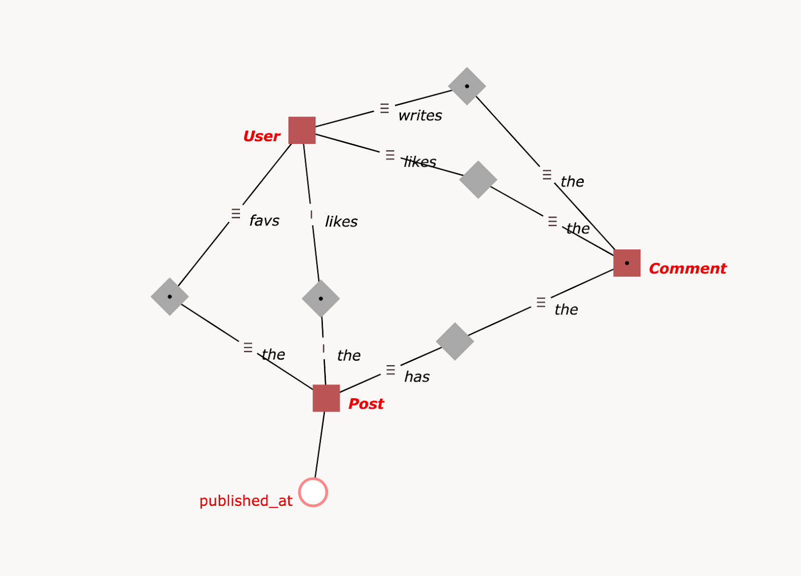
Minimal Modeling takes some ideas from the Anchor Modeling, exploring them further. So it was especially interesting to see how their official modeler handles this.
In this picture we see:
There are five links, just as in the text; however, the links look more complex than expected: links are graphically built from:
a gray square;
two lines that connect that gray square to the red squares that denote the anchors;
each line has some sort of handle (≡);
each line corresponds to something that in Anchor modeling is called “role”;
I could not find modeling guidance on how to choose the roles for the parts of anchor. Their own examples of modeling look roughly the same to me, but maybe I’m missing something. Because of that I’ve used such roles as “favs” and “the” (?!) for the link that in MM is described as “⚓User favs ⚓Post”;
Graphical representation of an attribute (red circle with “
published_at”) clearly shows that the attribute is independent from the anchor (even though they are connected);
TLDraw
TLDraw is a general purpose drawing tool. What we can see here:
The visual style matters. This picture looks cute, and it sends a visual signal of being somewhat “hand-written”. Compare to the default Mermaid formatting, presented in Part II.
Here I tried to experiment with the visual style of how an attribute and its anchor are related. One of the main ideas in Minimal Modeling is that anchor is NOT a container for attributes. That’s why “Post” tries so hard not to look like a container.
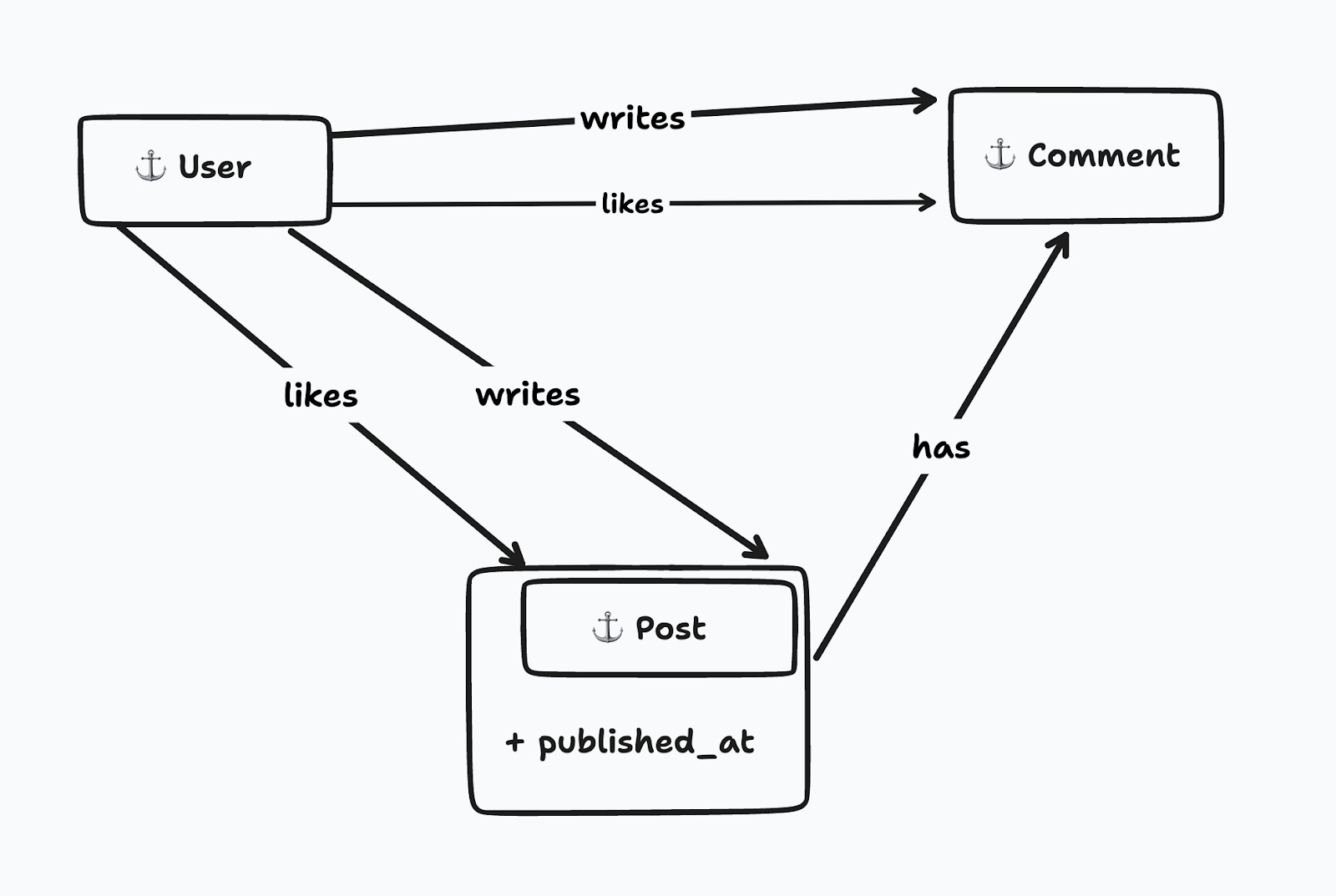
Arrows.App

Arrows app is used by one of the early adopters of Minimal Modeling, with good results. This tool is more graph-based, for example it shows clearly how many nodes and relationships are in the picture. The attribute placement is logical and concise.
Conclusion
In this post we looked at the examples of various drawing tools and compared their visual language. This concludes the “visualizing database” series.
In one of the upcoming posts we’re going to discuss the links as fragments of underlying business processes.
And another reminder: on January 23rd, 19:00 CEST, we’re going to host the “Minimal Modeling of Twitter.com, without database” Zoom meeting. Details: https://minimalmodeling.substack.com/p/jan-23-1900-cest-zoom-minimal-modeling
Registration link: https://us02web.zoom.us/meeting/register/tZIsdu-hqjkoE9ZtFYEzSJpFxo_h5ynYOTfc