How to visualize your database using Minimal Modeling
Many people prefer graphical representations of business processes. Also, many people like to see database schemas represented visually. It turns out that Minimal Modeling helps with visualizing databases. In this post I’m going to show you how.
In Minimal Modeling there are three main concepts: anchors, attributes and links. As an example, let’s take the minimal model of Mokum social network, described here: https://mokumplace.notion.site/db24d171613b4528b60f9e1a1c11b70c. There are 57 links at the time of writing. Each link is described by a small sentence, such as “User likes Post”, where “User” and “Post” are anchors (also known as entities, also known as nouns).
I’ve created a page that shows most of Mokum database as a number of graphs: https://mokumplace.notion.site/Mokum-database-schema-visualized-b8deb3d26c404f1e8200e140bde66bf This post is based on that page.
Let’s see what we can learn here.
Core anchors and links, visualized
Mokum is a pretty straightforward social network. Its basic, core functionality could be shown as a graph:
…and also in textual form:
Users create posts; users can also like the posts and add them to favorites;
Posts can have comments (of course, comments are written by users); also, users can like comments too;
Users can upload images, and attach them to the posts and also attach them to the comments;
Also, users can create “k-texts” (long-form texts);
Finally, you can add “embeds” to the post, such as Bandcamp and Soundcloud players.
There are 11 arrows in the picture, and there are 11 verbs (written in bold font) in the list of features.
Also, each of the 11 arrows directly correspond to a row in the table of links:
What about the other 46 links? It quickly becomes obvious that if you add too many links to the single picture it starts to look like an unreadable mess (TODO: show!). So let’s try and create another graph.
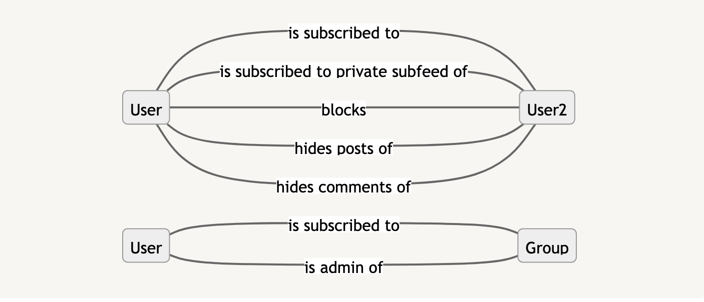
Relationships between users, visualized
There are 7 arrows in this graph. Let’s write them down:
Users can subscribe to other users (also, they could subscribe to “private subfeeds” which is basically a close circle of subscriber);
Users can block each other, hide posts of some users they prefer to not to see, and hide their comments in others’ posts;
Users could become group administrators, and they can also join groups;
Again, we see that there are 7 verbs in the textual representation of the graph above. Again, each arrow directly corresponds to a link that we could find in the list of links. There we would also find a small SQL query that shows how to get the actual data: basically, a two-column dataset that show who blocks whom:
SELECT user_id, banned_user_id
FROM banned_users
There are two user IDs in each row: first user blocks second user.
To be continued…
What we can see in the graphs above?
They are quite easy to generate, because most of the description work has already been done when you created the minimal model in the tabular form.
They match reality: each graphical element in the picture has a corresponding anchor or link, and thus it could be found in some table in your database. You can easily find detailed information about each arrow.
The graphs are easy to explain: each graph could also be described as a paragraph of text, and this text actually makes sense. You could add the graph to the slide, or add it to a design document, or include it in the onboarding document.
Next week we’ll discuss:
How the traditional, table-based visualizations look in comparison with this approach;
What tools you can use to created visualizations as presented above;
Links as fragments of underlying business processes;
Multiple points of view of the same data (see “Timeline structure” section on the “Mokum database schema visualized” page).


That's not "visualizing database", that is "visualizing database interactions", which is a completely different beast. Visualizing databases help scope the domain, visualizing interactions help scope the workload type. And they may or may not be within the realm of the same process.
Also, starting from top to bottom, most of the examples are actually too simplistic to be taken into account - when you have "user writes post" (I'm not even going to nitpick how that translates in your example to a select instead of an insert, but lets assume its not a user story), you are discarding context on purpose - user writes post WHERE? his timeline? a group? is it a comment post?
Is this relevant? Yup, because the simplistic graph examples don't work when you have a multi-level structure where you're posting to, or conditional rules to actually allow posting. Thing is, in *real life* you will often have database schemas (maybe visually), AND business rules, mapped independently, not this mish-mash. If you think I'm wrong, pick a simple social network (like eg. twitter) and try to map it using your approach, with consistent results.